Making a Stand for Gnarly Head

Back in 2008 we had a chance to generate some ideas for a small footprint floor display for Gnarly Head wines. The colorful, rustic logo evoked a rustic but premium feel, so we did our best to interpret it into a three dimensional form that would meet their budget, bear the significant weight of 3 cases of wine, knock down flat for easy shipping and assemble with minimal tools. We took special care to give the logo some dimension using die cuts, screened transparent panels and distortion-printed vac-forms.

Premium Coffee Deserves a Nice Rack

Illy is the kind of brand that designers love to work with. Their brand identity adheres well to the essential principles of good design that we're trained to uphold: Simple, clean, bold, clear, functional, instantly identifiable. That doesn't mean, however, that in designing a floor display for the brand that you shouldn't inject a dose of whimsy just to tone down the austerity a little in a ploy for better visibility in the visual chaos of the average store.

how to sell Wine with Sports

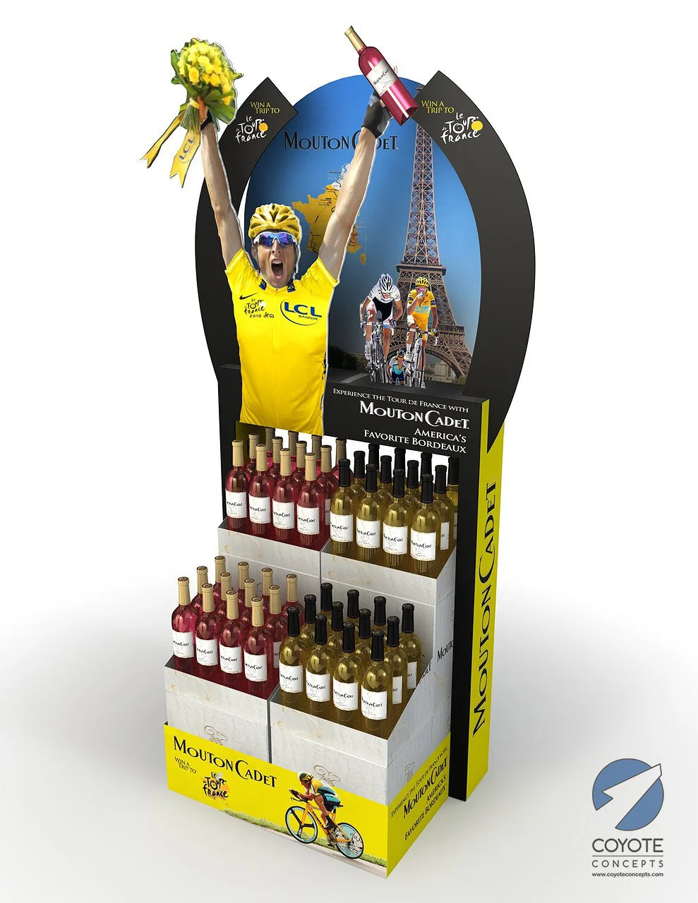
It's long been a standard marketing practice for brands to temporarily align themselves with a team or event to create programs with the goal of increasing awareness. This was the case when Mouton Cadet wines hooked up with the Tour de France back in 2010 and we were consulted to provide creative tie-ins between their wines and the wildly popular bicycle race.

Beer, Branding, and a Battery Boost

Heineken was looking for a bold presence at the bar, but they didn't want to just stick a sign in a frame or print up thousands of fragile table tents that would just get ignored and destroyed in a few days. They wanted something with longevity that would attract attention and encourage some kind of engagement with the consumer and/or bartender by providing utility.

Bavarian Brandstand!

How do you make a tire display look upscale? This was the challenge when we were asked to design a Pirelli tire display for BMW dealerships. Our answer took the form of silver powder coated steel structure comprised of sleek sections using a visual vocabulary of ellipses. A colorful banner provided a callback to Pirelli's racing heritage, and the BMW icon was glorified with a glossy dimensional treatment on top

At the Corner of Hollywood and Wine

Coppola Wines needed a way to showcase their signature "Director's Cut" wine in a floor display that would provide them with maximum merchandising capacity while communicating their brand identity in simple and bold way. We decided to design a simple round metal rack and kick it up a notch by incorporating a helical banner to echo the packaging, then added a film reel base. It was a hit!

Driving Brand Awareness in Costco

We had an opportunity a few years back to design a large counter display for a major security camera manufacturer who desired a strong presence in Costco. Molding wasn't an option, so we tried to stick with forms that could be achieved with sheet metal construction. The graphics were supplied by the customer, so our challenge was to provide space for them in a way that told the story to the consumer in as logical and concise a way as possible

Elevating Brands with Cardboard Sculpture

As a structural material, corrugated cardboard can be incredibly versatile and remarkably strong. With the proper graphic treatment, strategically placed folds, and a few interesting die-cuts, a simple graphic idea can be transformed into an attention-grabbing visual exhibition that not only supports heavy packaging and boosts brand awareness, but also moves a heck of a lot more product out the door. Few materials offer similar retail power so economically. It's not surprising it's so popular.

Killing it at Retail

How do you create a versatile structure to securely hold, organize, and display energy shots, plus make it easily sit on a counter, hang on the side of a cooler, or attach to a glass door? Our solution involved a steel ring structure featuring spring clips to grip the product, plus four supports designed to accommodate magnets, suction cups, or rubber feet. It then completed the look with large interchangeable vacuum-formed icons to trumpet the brand to the consumer.

Seeing it makes you want to hear it

Back in 2002, Onkyo needed a high-end looking display to showcase their latest surround sound system. The challenge was in devising an aesthetically appealing method to suspend the rear speakers behind the consumer so that they could enjoy the full audio experience. I came up with a few options using powder coated metal tubing.

A Well-oiled sales machine

Mobil needed a floor display that would showcase their flagship motor oil. They wanted it to convey an identity that's as tough, durable, and long lasting as the product itself. We chose to integrate components molded in a silver finish to match the packaging, ribbed details, diamondplate, and hexagonal bolt heads. A large interchangeable header graphic area with a sample bottle and a literature pocket on the side completed the look.

POP = Identity in 3D

Few brands have as well-defined an identity as the brand pictured below. Showcasing this identity while taking into account budget, scale, and structure is not a task for lightweights. It takes years of practice to be able to deliver concepts that hit every mark. Designers like to complain about the difficulty of providing a fresh, eye-catching designs under such daunting constraints, but often it is precisely these kinds of challenges which ultimately produce the most noteworthy results.

Making it Sparkle

Let's usher in the new year with a few examples of the many sparkling wine display concepts we've created over the years. We've created eye-catching permanent and temporary concepts for a slew of brands with a wide range of budgets. Call us if you need some fresh ideas!

Out of the Shoebox Concepts to Wow Skaters

All creative professionals have to do a lot of fairly pedestrian work to pay the bills, so when this project came along, we were delighted for the chance to push the creative envelope. Because Etnies is a youth-oriented brand, it welcomes the use of interesting angles, energetic color schemes and gritty materials. Interpreting their identity into structural forms and choosing finishes which could be easily sourced and manufactured is no small feat, but we relished the challenge.

Kim Crawford's Curves

Curves are eye-catching in any form. We felt they fit the Kim Crawford brand quite well when we designed a floor display to showcase their highly rated wines. This design works as a single unit or in pairs to double the capacity.

A Creative Spin on Energy

How do you make your little energy drink bottle stand out against all the visual noise at the register? We addressed the challenge by first considering novel ways to support and showcase the bottles, then interpreted the graphic identity (in this case, gears) into three dimension

Art Nouveau and Champagne

I've always been a big fan of the Art Nouveau movement, so when I got an opportunity to design some displays for Domaine Ste Michelle sparkling wines some years ago, I was thrilled. These concepts were especially challenging because the lines and shapes which define Art Nouveau have to look as if they were sculpted by hand, but engineering sculptured forms would have been prohibitively expensive.